What is Adaptive Card Extension
Ø
Adaptive card Extensions are a new component
type that can be created using SPFx.
Ø
You use JSON schema to specify what kind of
controls/labels you wanted to show and then pass your dynamic data to render
this Adaptive card to the user.
Ø
One of the greater benefits of using an Adaptive
card is that it takes care of rendering into multiple platforms automatically
without us worrying about screen size and device etc.
Ø
We can just focus on the actual component logic,
the adaptive card framework will take care to fit the card into various
platforms, screen sizes, and devices.
Install latest SPFx Version
Adaptive Card structure
v
AdaptiveCard: The root object consist of
Adaptivecard itself
o
Version: version of Adaptive cards JSON… it
recommended to use 1.3 from Microsoft.
o
Body: consists of several elements and actions
which are optional.
§
Adaptive Elements --> TextBlock,
RichTextBlock, Image, Media, ActionSet
§
Container Elements --> Container,
ColumnSet,…..etc
§
Input Elements --> Input.Text, Input.Date,
Input.Time
v
Actions: these are buttons which performs
different actions, it can be Action.OpenUrl, Action.ShowCard and Action.Submit
Create New Project
This will take couple of mins and at this point, Yeoman
installs the required dependencies
Test the card template using workbench
Local: gulp serve -l –nobrowser
Update project hosted workbench URL:
"initialPage": "https://liakathcloudeducation.sharepoint.com/sites/LiakathDev/_layouts/workbench.aspx"
o
Card View which you can see the above
screenshot.
o
Quick View will only works in preview mode
Examine the Code:
Base Class:
Open the below from you’re your VSC. \src\adaptiveCardExtensions\firstPrimaryCard\FirstPrimaryCardAdaptiveCardExtension.ts

1.
Properties: Similar to webparts, this is to set
the persisted properties.
2.
State: Unique to ACEs to maintain the state.
Rendering the Card:
The renderCard() method is virtual that returns a string identifier to a
registered/custom View.
In the code, below are the two identifiers declared
Default card view will render using the below properties from the
manifest
§
Icon – iconProperty
§
Title – title
§ Card Text - description
Register a Card and Quick Views (onInit Method):
Here we are registering the Card ID, QuickView ID
CardView Class
Locate and open the file:
./src/adaptiveCardExtensions/helloWorld/cardView/CardView.ts.
Understand 3 types of templates:
- BaseBasicCardView: This will allow us to set Title, PrimaryText, and Buttons.
- BaseImageCardView: This will allow us to set image, Title, PrimaryText, and Buttons
- BasePrimaryTextCardView: This will allow us to set Title, PrimaryText, description, and buttons
In this solution we have chosen PrimaryCardView during template type while
generating solution, you will see that class is extended with BasePrimaryCardView.
Save the file and run ‘gulp serve’ to the changes in the workbench.
Let’s modify the CardView.ts to change to use BasicCardView:
Change the Import to add “BaseBasicCardView”, and “IBasicCardParameters,”
Now modify the below line to change extends from “BasePrimaryTextCardView”
to “BaseBasicCardView”
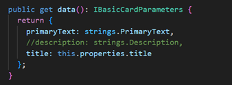
Once you save this code, you will see the error code in
data()
In the import method, we have declared ‘BasePrimaryTextCardView’, ‘IPrimaryTextCardParameters’ but not used
hence I am removing them to fix the error.
Save the file and run ‘gulp serve’ to the changes in the
workbench.
Let’s modify the same way if you extend the view from BaseImageCardView. we
will have to set imageUrl and primaryText in data method(sample below)
Change the Import to add “BaseImageCardView”, and “IImageCardParameters,”
Now modify the below line to change extends from “BaseImageCardView”
Save the file and run ‘gulp serve’ to the changes in the
workbench.
Card Buttons
cardButtons() method can be used if you want to display the
custom buttons on the card and what actions to be taken when the button is
clicked.
onCardSelection()
This method determines what will happen if the Card is
clicked. We can change the Card Selection method to open Quick view by
modifying the onCardSelection().
QuickView Class
Locate and open the following file:
./src/adaptiveCardExtensions/firstPrimaryCard/quickView/QuickView.ts.
Quick Views must extend the BaseAdaptiveCardView base
class.
Let’s change the below:
Ø Remove the description property from the Quick View data, and add two buttons.
Ø Update the IQuickViewData interface as shown in the following code and update the data() method as below:


No comments:
Post a Comment