1. Create SharePoint List using the Out of box template 'Issue Tracker'
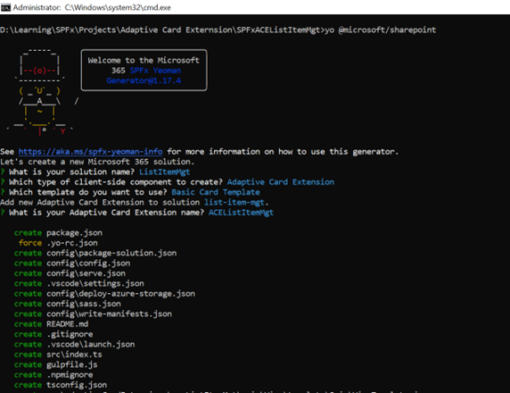
2. Create a project where client-side component as 'Adaptive Card Extension' and template as 'Basic Card':
yo @microsoft/sharepoint

3. Create service to handle all reading and writing to the SharePoint list data
Create a new file ./src/adaptiveCardExtensions/aceListItemMgt/sp.service.ts in the project and add the following code to it:
import { AdaptiveCardExtensionContext } from '@microsoft/sp-adaptive-card-extension-base';
import { SPHttpClient } from '@microsoft/sp-http'

export interface IListItem {
  id: string;
  title: string;
  issuedescription: string;
  priority: string;
  status: string;
  index: number;
}

export const fetchListTitle = async (spContext: AdaptiveCardExtensionContext, listId: string): Promise<string> => {
  if (!listId) { return Promise.reject('No listId specified.'); }

  const response = await (await spContext.spHttpClient.get(
    `${spContext.pageContext.web.absoluteUrl}/_api/web/lists/GetById(id='${listId}')/?$select=Title`,
    SPHttpClient.configurations.v1
  )).json();

  return Promise.resolve(response.Title);
}

export const fetchListItems = async (spContext: AdaptiveCardExtensionContext, listId: string): Promise<IListItem[]> => {
  if (!listId) { return Promise.reject('No listId specified.'); }

  const response = await (await spContext.spHttpClient.get(
    `${spContext.pageContext.web.absoluteUrl}/_api/web/lists/GetById(id='${listId}')/items?$select=ID,Title,Description,Priority,Status`,
    SPHttpClient.configurations.v1
  )).json();

  if (response.value?.length > 0) {
    return Promise.resolve(response.value.map(
      (listItem: any, index: number) => {
        return <IListItem>{
          id: listItem.ID,
          title: listItem.Title,
          issuedescription: listItem.Description,
          priority: listItem.Priority,
          status: listItem.Status,
          index: index
        };
      }
    ));
  } else {
    return Promise.resolve([]);
  }
}

const getItemEntityType = async (spContext: AdaptiveCardExtensionContext, listId: string): Promise<string> => {
  const response: { ListItemEntityTypeFullName: string } = await (await spContext.spHttpClient.get(
    `${spContext.pageContext.web.absoluteUrl}/_api/web/lists/GetById(id='${listId}')?$select=ListItemEntityTypeFullName`,
    SPHttpClient.configurations.v1
  )).json();

  return response.ListItemEntityTypeFullName;
}

export const addListItem = async (
  spContext: AdaptiveCardExtensionContext,
  listId: string,
  listItemTitle: string,
  listItemDescription: string,
  listItemPriority: string,
  listItemStatus: string): Promise<void> => {

    // get the entity type of list item
    const entityListItemType = await getItemEntityType(spContext, listId);

    // create item to send to SP REST API
    const newListItem: any = {
      '@odata.type': entityListItemType,
      Title: listItemTitle,
      Description: listItemDescription,
      Priority: listItemPriority,
      Status: listItemStatus
    };

    await spContext.spHttpClient.post(
      `${spContext.pageContext.web.absoluteUrl}/_api/web/lists/GetById(id='${listId}')/items`,
      SPHttpClient.configurations.v1,
      {
        headers: {
          'ACCEPT': 'application/json; odata.metadata=none',
          'CONTENT-TYPE': 'application/json'
        },
        body: JSON.stringify(newListItem)
      }
    );

    return Promise.resolve();
}
This service exports the following things you'll use
throughout the project:
addListItem(): This method creates a new item in the
specified list.
fetchListTitle(): This method retrieves the title of
the specified list.
fetchListItems(): This method retrieves all the items
in the specified list.
4. Update the Component to display the SharePoint list data
4.1 Update the ACE to enable the user to set the SharePoint list ID
Ø
Locate the ACE class in the file
./src/adaptiveCardExtensions/aceListItemMgt/AceListItemMgtAdaptiveCardExtension.ts
and open it in VS Code.
Ø
Locate the IAceListItemMgtAdaptiveCardExtensionProps
interface and add the listId property to store the ID of the SharePoint
list that contains the driver status records:
export interface IAceListItemMgtAdaptiveCardExtensionProps {
title: string;
listId: string;
}
Ø
Locate and open the file
./src/adaptiveCardExtensions/aceListItemMgt /AceListItemMgtPropertyPane.ts. Add
a new PropertyPaneTextField to the groupFields array to add an option for the
user to set the ID of the list that contains the driver status records:
groupFields: [
PropertyPaneTextField('title', {
label: strings.TitleFieldLabel
}),
PropertyPaneTextField('listId', {
label: 'List ID (GUID)'
})
]
Ø
Finally, go back to the AceListItemMgtAdaptiveCardExtension.ts
file and add the following method to the AceListItemMgtAdaptiveCardExtension
class. The SPFx runtime raises this event when the value of a property in the
property pane changes.
You'll
come back and update this method later.
protected onPropertyPaneFieldChanged(propertyPath: string, oldValue: any, newValue: any): void {
if (propertyPath === 'listId' && newValue !== oldValue) {
//
TODO onPropertyPaneFieldChanged
}
}
4.2 Update the ACE state and initial card view
Ø
Add the following import statement after the
existing import statements in AceListItemMgtAdaptiveCardExtension.ts:
Ø
Locate the state interface IAceListItemMgtAdaptiveCardExtensionState
and add a few properties as shown in the following code:
export interface IAceListItemMgtAdaptiveCardExtensionState {
listTitle: string;
listItems: IListItem[];
currentIndex: number;
}
Ø
Initialize the state property in the existing onInit()
method. Replace the existing this.state = { }; with the following code:
public onInit(): Promise<void> {
this.state = {
currentIndex: 0,
listTitle: '',
listItems: []
};
Ø
Next, add the following code to the onInit()
method, immediately before the return Promise.resolve(); statement to retrieve
title of the list and all items in the list, overwriting the empty values you
set when initializing the state.
if (this.properties.listId) {
Promise.all([
this.setState({ listTitle: await fetchListTitle(this.context, this.properties.listId) }),
this.setState({ listItems: await fetchListItems(this.context, this.properties.listId) })
]);
}
return Promise.resolve();
Ø
This code uses the await keyword but the
onInit() method signature, while it returns a Promise, it doesn't have the
required async keyword. Update the onInit() method declaration to include this
keyword:
public async onInit(): Promise<void> { .. }
Ø
Now that the public properties and state are
configured for the ACE component, you need to handle the case when a user
updates the list ID in the property pane.
Locate
the onPropertyPaneFieldChanged() method and replace the // TODO
onPropertyPaneFieldChanged with the following code:
protected onPropertyPaneFieldChanged(propertyPath: string, oldValue: any, newValue: any): void {
if (propertyPath === 'listId' && newValue !== oldValue) {
//
TODO onPropertyPaneFieldChanged
if (newValue) {
(async () => {
this.setState({ listTitle: await fetchListTitle(this.context, newValue) });
this.setState({ listItems: await fetchListItems(this.context, newValue) });
})();
} else {
this.setState({ listTitle: '' });
this.setState({ listItems: [] });
}
}
}
Ø
At this point, the ACE component is reading the
title and items in the SharePoint list. Let's now display that information in
the ACE rendering.
4.3 Update the ACE Card View
Let’s start with the CardView
Ø
Locate and open the
./src/adaptiveCardExtensions/aceListItemMgt/cardView/CardView.ts file in
VS Code.
Update
the existing data() method with the following code to change the primary
text displayed in the list.
public get data(): IBasicCardParameters {
return {
title: this.properties.title,
primaryText: (this.state.listTitle)
? `View items in the '${this.state.listTitle}' list`
: `Missing list ID`,
};
}
Ø
Next, locate the onCardSelection()
method. Change this to launch a QuickView instead of an external link by
replacing the object returned with the following code:
public get onCardSelection(): IQuickViewCardAction | IExternalLinkCardAction | undefined {
return {
type: 'QuickView',
parameters: {
view: QUICK_VIEW_REGISTRY_ID
}
};
}
4.4 Update the ACE QuickView
Ø
Let's update the Adaptive Card for the QuickView
to display the data from the SharePoint list as a carousel.
Ø
Locate and open the
./src/adaptiveCardExtensions/aceListItemMgt/quickView/template/QuickViewTemplate.json
file and replace its contents with the following code:
{
"$schema": "http://adaptivecards.io/schemas/adaptive-card.json",
"type": "AdaptiveCard",
"version": "1.5",
"body": [
{
"type": "ColumnSet",
"columns": [
{
"type": "Column",
"width": "30px",
"items": [
{
"type": "Image",
"url": "data:image/svg+xml;utf8,<svg xmlns=\"http://www.w3.org/2000/svg\" fill=\"none\" viewBox=\"0 0 24 24\" stroke-width=\"1.5\" stroke=\"currentColor\" class=\"w-6 h-6\"><path
stroke-linecap=\"round\" stroke-linejoin=\"round\" d=\"M18.75 19.5l-7.5-7.5 7.5-7.5m-6 15L5.25 12l7.5-7.5\" /></svg>",
"size": "Small",
"width": "30px",
"selectAction": {
"type": "Action.Submit",
"id": "-1",
"title": "Previous"
},
"isVisible": "${previousEnabled}",
"horizontalAlignment": "Left"
}
],
"verticalContentAlignment": "Center"
},
{
"type": "Column",
"width": "auto",
"items": [
{
"type": "Container",
"items": [
{
"type": "TextBlock",
"text": "(${id})
${title}",
"horizontalAlignment": "Center",
"size": "Medium",
"weight": "Bolder",
"wrap": true
},
{
"type": "TextBlock",
"text": "${description}",
"horizontalAlignment": "Center",
"size": "Default",
"wrap": true
},
{
"type": "Input.Text",
"id": "priority",
"label": "Priority",
"placeholder": "Priority",
"isMultiline": true
},
{
"type": "Input.Text",
"id": "status",
"label": "Status",
"placeholder": "Status",
"isMultiline": true
},
]
}
]
},
{
"type": "Column",
"width": "30px",
"items": [
{
"type": "Image",
"url": "data:image/svg+xml;utf8,<svg xmlns=\"http://www.w3.org/2000/svg\" fill=\"none\" viewBox=\"0 0 24 24\" stroke-width=\"1.5\" stroke=\"currentColor\" class=\"w-6 h-6\"><path
stroke-linecap=\"round\" stroke-linejoin=\"round\" d=\"M11.25 4.5l7.5 7.5-7.5 7.5m-6-15l7.5 7.5-7.5 7.5\" /></svg>",
"size": "Small",
"width": "30px",
"selectAction": {
"type": "Action.Submit",
"id": "1",
"title": "Next"
},
"isVisible": "${nextEnabled}",
"horizontalAlignment": "Right"
}
],
"verticalContentAlignment": "Center"
}
],
"spacing": "None",
"horizontalAlignment": "Center",
"height": "stretch",
"style": "emphasis",
"bleed": true
}
]
}
Ø
Now let's update the QuickView class.
Ø
Locate and open the
./src/adaptiveCardExtensions/aceListItemMgt/quickView/QuickView.ts file.
Start by updating the imports section:
1.
Add a reference to the IActionArguments
interface imported from the @microsoft/sp-adaptive-card-extension-base package:
import {
ISPFxAdaptiveCard,
BaseAdaptiveCardView,
IActionArguments //
<< add
} from '@microsoft/sp-adaptive-card-extension-base';
2.
Add the following code to import the interface
from the SharePoint service file you added to the project:
import { IListItem } from '../../sp.service';
3.
Next, update the existing IQuickViewData
interface to extend the IListItem interface and add two more properties:
export interface IQuickViewData extends IListItem {
previousEnabled: boolean;
nextEnabled: boolean;
}
4.
Next, update the data() method to the
following code. This will return the currently selected item retrieved from the
SharePoint list, along with two more properties, as an object to the Adaptive
Card rendering engine. The properties on this object are bound to specific
elements in the Adaptive Card template:
public get data(): IQuickViewData {
return {
previousEnabled: this.state.currentIndex !== 0,
nextEnabled: this.state.currentIndex !== (this.state.listItems.length - 1),
...(this.state.listItems[this.state.currentIndex])
};
}
5.
Next, add a new method, onAction(), to
handle a submission from the QuickView's Adaptive Card. In this scenario, two
images are used to cycle through the items retrieved from the SharePoint list:
public onAction(action: IActionArguments): void {
if (action.type !== 'Submit') { return ;}
let currentIndex = this.state.currentIndex;
this.setState({ currentIndex: currentIndex + Number(action.id) });
}
6.
Finally, comment out or remove the following
reference to the strings object:
//import * as strings from
'AceListItemMgtAdaptiveCardExtensionStrings';
4. 5 Test the dynamic ACE

Once you enter the List ID, you'll see the new updated
rendering for the QuickView and a set of arrows that will cycle through all items
in the list:
5. Update the component to add items to the list
Ø
In this last section, add a new QuickView to add
items to the SharePoint list. This demonstrates how you can use QuickViews to
collect data from a form.
Ø
Create a new file, NewItemQuickView.ts, in
the ./src/adaptiveCardExtensions/aceListItemMgt/quickView folder and add the
following code to it:
import {
ISPFxAdaptiveCard,
BaseAdaptiveCardView,
IActionArguments
} from '@microsoft/sp-adaptive-card-extension-base';
import { IAceListItemMgtAdaptiveCardExtensionProps, IAceListItemMgtAdaptiveCardExtensionState } from '../AceListItemMgtAdaptiveCardExtension';
import {
fetchListItems,
addListItem
//} from 'D:/Learning/SPFx/Projects/Adaptive Card
Externsion/SPFxACEListItemMgt/src/adaptiveCardExtensions/sp.service';
} from '../../sp.service';
export interface INewItemQuickView { }
export class NewItemQuickView extends BaseAdaptiveCardView<
IAceListItemMgtAdaptiveCardExtensionProps,
IAceListItemMgtAdaptiveCardExtensionState,
NewItemQuickView
> {
//public
get data(): NewItemQuickView {
//return
undefined;
//}
public get template(): ISPFxAdaptiveCard {
return require('./template/NewItemQuickView.json');
}
public onAction(action: IActionArguments): void {
if (action.type === 'Submit') {
(async () => {
// save item
await addListItem(
this.context,
this.properties.listId,
action.data.title,
action.data.description,
action.data.priority,
action.data.status
);
// refresh items
this.setState({ listItems: await fetchListItems(this.context, this.properties.listId) });
// remove quickview
this.quickViewNavigator.close();
})();
}
}
}
Ø
The interesting part of this QuickView is the
onAction() method. Notice how it gets the information from the input controls
in the Adaptive Card using the data property on the action: IActionArguments
object passed into the method.
After saving the item to the list, it refreshes the list of items,
updates the item collection on the ACE's component state, and closes the
QuickView.
Ø
Now, implement the rendering for the QuickView.
Create a new file NewItemQuickView.json in the
./src/adaptiveCardExtensions/sharePointRestCrud/quickView/template and add the
following code to it:
{
"$schema": "http://adaptivecards.io/schemas/adaptive-card.json",
"type": "AdaptiveCard",
"version": "1.5",
"body": [{
"type": "Container",
"separator": true,
"items": [
{
"type": "Input.Text",
"id": "title",
"label": "Title",
"placeholder": "Title",
"isMultiline": false
},
{
"type": "Input.Text",
"id": "description",
"label": "Description",
"placeholder": "Description",
"isMultiline": true
},
{
"type": "Input.Text",
"id": "priority",
"label": "Priority",
"placeholder": "Priority",
"isMultiline": true
},
{
"type": "Input.Text",
"id": "status",
"label": "Status",
"placeholder": "Status",
"isMultiline": true
},
{
"type": "ActionSet",
"actions": [{
"type": "Action.Submit",
"id": "save",
"title": "Save",
"style": "positive"
}]
}
]
}]
}
Ø
To use this new QuickView, you need to register
it:
1.
Open the ./src/adaptiveCardExtensions/aceLitItemMgt/aceListItemMgtAdaptiveCardExtension.ts
file.
2.
Add the following import statement to import the
NewItem QuickView:
const CARD_VIEW_REGISTRY_ID: string = 'AceListItemMgt_CARD_VIEW';
export const QUICK_VIEW_REGISTRY_ID: string = 'AceListItemMgt_QUICK_VIEW';
export const NEW_ITEM_QUICK_VIEW_REGISTRY_ID: string = 'AceListItemMgt_NEW_ITEM_QUICK_VIEW';
3.
Within the onInit() method in the AceListItemMgtAdaptiveCardExtension
class, add the following code after the existing call to the
this.quickViewNavigator.register() statement that registered the StartTrip
QuickView:
this.cardNavigator.register(CARD_VIEW_REGISTRY_ID, () => new CardView());
this.quickViewNavigator.register(QUICK_VIEW_REGISTRY_ID, () => new QuickView());
this.quickViewNavigator.register(NEW_ITEM_QUICK_VIEW_REGISTRY_ID, () => new NewItemQuickView());
6. The last step is to update the CardView to trigger the new item.
Ø
Locate and open the ./src/adaptiveCardExtensions/acelistitemmgt/cardView/CardView.ts
file.
Ø
Add the new QuickView ID exported from the AceListMgtAdaptiveCardExtension
to the list of existing objects imported from that module:
import { IAceListItemMgtAdaptiveCardExtensionProps, IAceListItemMgtAdaptiveCardExtensionState, QUICK_VIEW_REGISTRY_ID, NEW_ITEM_QUICK_VIEW_REGISTRY_ID } from '../AceListItemMgtAdaptiveCardExtension';
Ø
Next, replace the existing cardButtons()
accessor with the following code. This updated implementation will now only
show a button Add item when the list ID has been set in the property pane. When
this button is selected, it launches the new QuickView:
public get cardButtons(): [ICardButton] | [ICardButton, ICardButton] | undefined {
if (!this.properties.listId) {
return undefined;
} else {
return [{
title: 'Add item',
action: {
type: 'QuickView',
parameters: { view: NEW_ITEM_QUICK_VIEW_REGISTRY_ID }
}
}];
}
}
Ø
Finally, comment out or remove the following
reference to the strings object:
Ø
Save the file and run ‘gulp bundle’ and then ‘gulp
serve’


